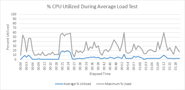
I recently encountered an obstacle when trying to import server metrics into LoadRunner Analysis for use in a report for a customer. To work around the problem, I decided to create my graphs in Excel. Easy enough. My metrics were in a .CSV file with data points for time and usage. I used the time stamps to generate relative time data in the form of hh:mm:ss. This resulted in a graph which looked like this:
However, my customer was familiar with the merged graph of Running Vusers in relation to server metrics and this is part of our usual reporting. What to do?
The solution involved querying the raw data saved by the LoadRunner Controller in the test results .mdb file. I created a new query and ran the following SQL statement:
SELECT M.[End Time] AS ElapsedTimeInSeconds, M.[VUser ID] AS VuserID, M.[VUser Status ID] AS StatusID, S.[Vuser Status Name], (SELECT Count( VuserEvent_Meter.[VUser Status ID] )
FROM VuserEvent_Meter WHERE
VuserEvent_Meter.[InOut Flag]=1 AND
VuserEvent_Meter.[End Time]<=M.[End Time] AND
VuserEvent_Meter.[VUser ID]>=0 AND
VuserEvent_Meter.[VUser Status ID]=2) AS StatusRun, (SELECT Count( VuserEvent_Meter.[VUser Status ID] ) FROM VuserEvent_Meter WHERE
VuserEvent_Meter.[InOut Flag]=1 AND
VuserEvent_Meter.[End Time]<=M.[End Time] AND
VuserEvent_Meter.[VUser ID]>=0 AND
VuserEvent_Meter.[VUser Status ID]=4) AS StatusQuit, ([StatusRun]-[StatusQuit]) AS RunningVusers
FROM VuserEvent_Meter AS M INNER JOIN VuserStatus AS S ON M.[VUser Status ID] = S.[Vuser Status ID]
WHERE (((M.[VUser ID])>=0) AND ((M.[VUser Status ID]) In (2,4)) AND ((M.[InOut Flag])=1))
ORDER BY M.[End Time];
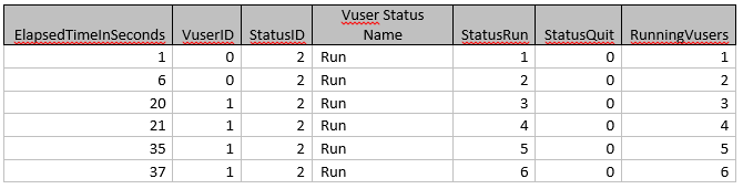
This gave me a data set (shown partially below) which I copied into Excel:
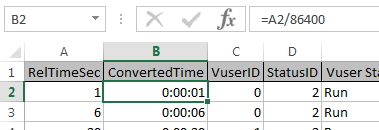
To create the graph, I first needed to convert the elapsed time (in seconds) to a format Excel could use. To do that I inserted a column and populated the cells with a value equal to the elapsed seconds divided by 86,400 (the number of seconds in 24 hours). Next, I formatted the column with the custom number format hh:mm:ss.
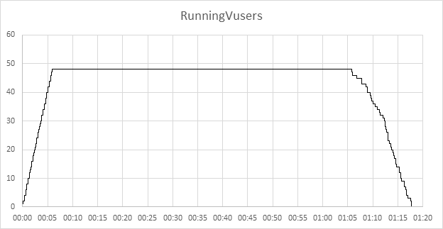
I then had all the data I need to create an interesting line graph, but would it look familiar enough to my customer? What I really needed was a step chart.
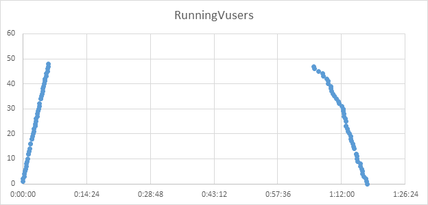
Using the Excel-friendly elapsed time data as my horizontal axis and my Running Vusers column as my vertical axis, I created an XY scatter point graph:
Notice the lack of connecting lines. Creating the stair steps required the use of X and Y error bars but, to do this, additional data points were needed.
I created two columns and named them “X-error” and “Y-error”
The X-error value is the value of the Excel-friendly (converted) time one row below, minus the value directly above it. To illustrate:
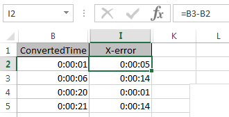
Create the formula for the first row and auto-fill the column. Then, delete the formula from your last row.
The Y-error value is the value of your running vusers in the same row minus the running vusers in the row above as illustrated here:
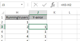
Notice that the cell in the top row of data is blank. No formula or value goes here. Auto-fill the rest of the cells in the column with this formula. Now, we add the X and Y error bars to our chart and format them to look like stair steps.
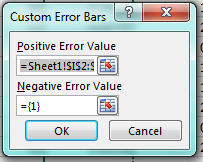
Format your horizontal error bars with a “Plus Direction” and “No caps” The data for the error amount comes from the “X-error” column and includes the blank cell. Choose “Custom” from the Error Amount section and then click “Specify Value”. Leave the Negative value as it is and change the Positive value to the X-error range, including the blank cell.
Similar steps are used to format our Y-error bars:
Format the vertical error bars with a “Minus Direction” and “No Caps.” The data for the error amount comes from the “Y-error” column and includes the blank cell. Choose “Custom” from the Error Amount section and then click “Specify Value.” Leave the positive value as it is and change the negative value to the Y-error range, including the blank cell.
By default, Excel colors the Y and X error bars differently, so you might choose to change this so they are both the same color. You might also wish to remove the markers for your series data.
All that remains to be done is to format the values on our X-axis so they display time in a friendly format. To do this, set your major axis units to the value in seconds you want displayed (in this example, every 5 minutes (300 seconds) divided by the number of seconds in a day (86,400). I won’t keep you guessing. The value is 0.0034722222. The minor tick marks are 60 seconds so the value for the minor tick mark is 0.00069444444.
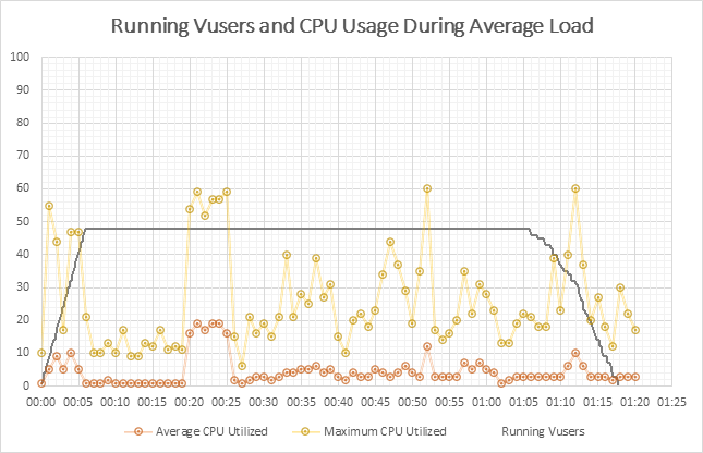
Finally, we have something very usable to put in a customer report:
If you recall at the beginning of this post, I said my objective was to provide my customer with server metrics overlaid with Running Vuser data. To do this I simply copied the above graph, selected my metric graph and pasted. The final product looked like this:
I used two sources to help me develop this graph. The first resource was K. Sandell’s answer to a question regarding the SQL behind the Running Vuser graph on stackoverflow.com. I had to make a few adjustments to his solution to get just the information I needed, but it is an excellent resource from which to start. I also used Andy Pope’s tutorial on how to create a step-line chart.