I like to make decisions based upon data. One of the more challenging decisions a leader of a functional area will have is workload prioritization. Fact based decisions, in a spreadsheet, are a great way to communicated with executive leaders in IT.
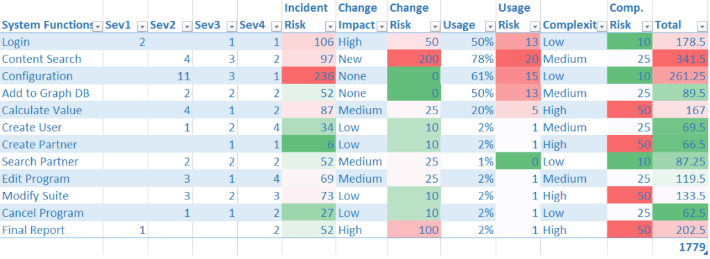
One cool method, to determine the test prioritization, I’ve used was a heat map to capture the demands from the stakeholders. We needed to insure that the development team, requirements team, and the support team had an equal footing in our engineering capacity design. The diagram below shows a sample of a heat map that accounts for support team production incidents, the qualitative risk from development and the actual usage of the system.
Support Incidents into Risk Analysis
From a quality perspective, we worked with the support team to categorize the production incidents by major feature area. This was not stored directly in HP Service Manager; we did this as part of our continuous improvement during the Root Cause Analysis(RCA) we performed as a QA team with the support group. We uncovered many things during RCA, but that is another story. For now, we simply correlated system function to a production incident. The incidents were already categorized by severity.
The final calculation is recorded in the incident risk column. It calculates the count of incidents multiplied by an importance factor. Note that these overall values are coordinated amongst the stakeholders above. By creating clear rules for the calculation, we can simplify the discussions.
Change Impacts into Risk Analysis
This was not an exercise performed before one sprint. This was an overarching analysis of the test strategy across multiple releases. The fact is that we had to create specific test programs to focus upon the feature areas. The scope of change for this time period helped define the risk vectors used in the final value. At this point, in the planning phase, the it was all that we had. Please note that as the project progressed we re-visited the changes to consider the engineering effort. Additionally, we developed some automation tools that spanned multiple areas that helped reduce some of the costs based upon project change.
Usage Frequency to Risk Analysis
The marketing team helped us to determine overall usage. In more recent sites, we have some great data from Google Analytics that makes this calculation very easy. If you were designing a mobile solution or a web application you could create a column directly from recent usage. In this scenario, we used the internal transaction logs that we had created for performance monitoring already. This was a commonly used process so the customer stakeholders were well versed in the names and usage. The usage column turned out to be of somewhat lower priority after the stakeholders performed the game part of the prioritization, but it was very easy to capture the data so we included it.
Solution Complexity into Risk Analysis
The QA team and the development team evaluated the risk based upon several factors. These included the number of functional inputs, the code size to support the feature, and the results from the static analysis tools. The functional input analysis is critical to white box and API testing. So we leveraged this directly into the prioritization analysis. These data would bear fruit in our test estimation process.
The code size was more amorphous. We simply asked the development team to consider if the code required to support it was in one of three buckets, in terms of size; which actually included the supporting libraries. We did make special note of areas that had been deemed riskier, because their open source libraries were relatively new. However, we countered this impact with the fact that the development team owned unit testing these libraries more than the QA team did.
Finally, we had also recently turned on the free open source tools that calculated code complexity for us. So, since this was also very easy to capture, we put this into the table as well; although, at a somewhat lower priority
Summary in Total
Using this heat map approach created a clear and present calculation for engineering spend plan that our finance team loved. It also created a fair representation from the stakeholders of quality except, of course, the customer, who in this situation could not be directly queried for their feedback. In later exercises, we devised a feedback loop… but that is another blog post.
Note that this was also an analysis performed in parallel to the other major QA activities for this organization which were: Performance, Usability, and Security. I will note that the lion’s share of the resources did go to this program, the team had over 20 people. In particular, the usability and security teams were one to two people each so this analysis would have been overkill.
David Guimbellot, Area Vice President of Test Data Management & Continuous Delivery at Orasi Software
