A histogram is a statistical graph used to show the number of times data, inside a collection, falls within a particular range. In performance testing, you can use a frequency distribution histogram to illustrate the frequency and dispersion of transaction times.
In this example we will report on a transaction, which is a cause for concern for the application stakeholders, the login process.
Notice that this graph has some important characteristics that distinguish it from a standard bar graph.
- This graph is a summary of data rather than a plot of individual data items.
- There is no white space between the bars, visually indicating a range of data that flows from a lower to upper limit.
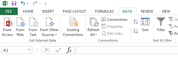
To acquire the data for this graph you must first open your results Access file from within Excel. In this example I am using Office 2013. From within a blank workbook, select the “Data” tab and click the “From Access” button.
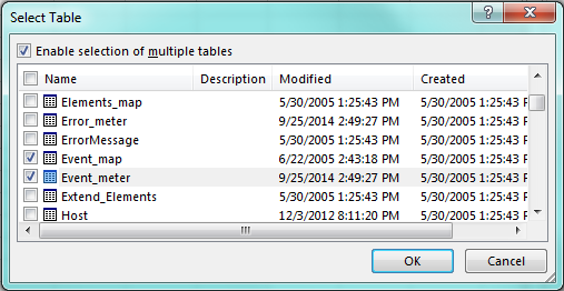
Navigate to your results .mdb file and click “Open.” You will then see the Select Table dialog. The data you need is stored in two tables, so you must “Enable selection of multiple tables,” then scroll down to find and select “Event_map” and “Event_meter.”
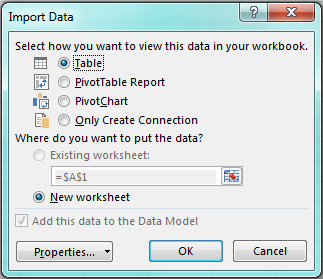
Once you click “OK,” you will have to choose how you want to view this data in your workbook. Select “Table” and be sure that “New worksheet” is auto-selected, then click “OK.”
At this point, you will have two worksheets populated with the data from the two tables you imported into Excel.
Event_map will tell you the transaction ID of the transaction you would like to plot. You will use this to filter the results in the Event_meter worksheet.
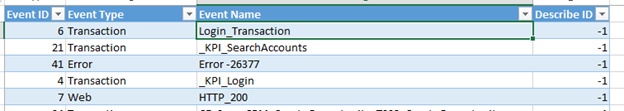
I will use the Event ID value of “4” to filter my results in the next worksheet. Once the filter is applied, I select the visible rows and copy/paste the values only into a new worksheet.
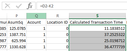 At this point you will need to calculate the true Transaction Time, eliminating Think Time from the value stored in the field, “Value.” Create a new column and set the cells in this column equal to Value – Think Time).
Histogram data is summarized in ranges or “bins.” We must now decide what information is most useful to the stakeholders of the application under test. In this case, the business and development teams want to know if a great number of users experience login transaction times of over five seconds. Our bins will be in increments of 1 second, as follows:
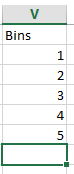
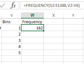
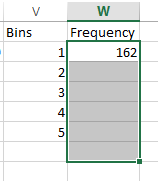
The bin number is the top end of the bin range. In our next calculation, all values in our Calculated Transaction Time column which are less than or equal to 1 will be counted toward the “1” bin. All values which are greater than 1 but less than or equal to 2 will be counted toward the “2” bin, etc. We will use the Excel formula frequency() to acquire these values.
Frequency() requires two values: the data array and the bins array. The data array is the column of numbers you want summarized. The bins array is the column of bin numbers. When you type this formula and press Enter, the first Frequency value will be calculated.
To get the rest of your frequency values, you will need to do the following:
- Highlight the cell you just populated and all the cells beneath to one cell below where your bin values end:
 Click inside the formula bar for the Bin 1 frequency:
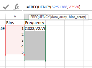
- Press CTRL-SHIFT-ENTER. This converts your formula to an “array formula,” and populates the cells below with the appropriate values for each bin.
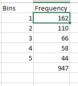
Notice the value next to the blank bin? That’s every other value that can’t be categorized in the other bins. On our chart we will label these values as “>5 seconds.”
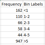
Our final step before graphing is to create our bin labels. Ideally, Excel would place our histogram bars between the ranges of values they represent. Unfortunately this cannot be accomplished without extra effort and a bit of “trickery.” I’ll include a link at the bottom of this post if you would like to explore placing your labels aligned to the left and right of your bars.
Insert a 2D column chart. Edit your data such that Frequency is your Y axis and the Bin labels are along your horizontal axis.
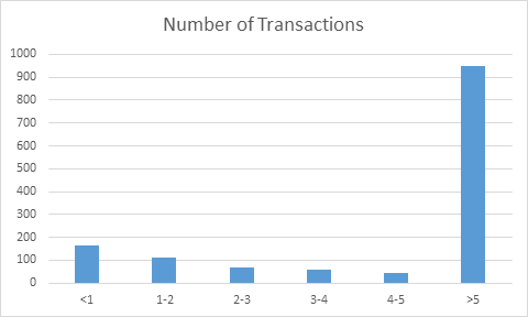
So far, so good. But this graph needs to express a continuous series of data and to do this, we must remove the gaps between the bars.
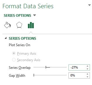
Right-click on any of the bars and select “Format Data Series.” Under the Series Options tab (the symbol looks like bar chart), Set the Gap Width to 0%. If you like, you can also outline your bars.
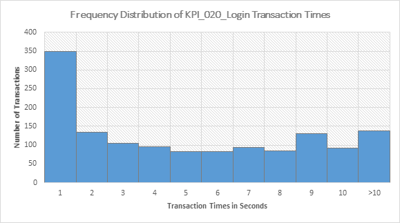
From here you can appropriately title and label your graph. The finished product should look something like this:
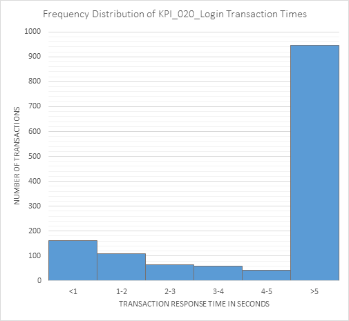
With this graph, a problem with the response time for logging into the application under test is quickly communicated to the stakeholders.
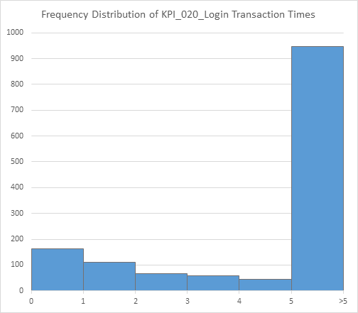
With a bit of extra work, you can communicate your message even more clearly:
The information contained in the results database, generated by LoadRunner, is a gold mine just waiting to be tapped. So far, I’ve shown you how to create your own Running Vuser graph, merge it with server metrics and create a histogram of transaction times. As I discover more nuggets that would be useful to your performance testing analysis, I’ll be sure to pass them on to you here. Check back soon!
Sources: